

Selected projects
Take a look through what I have worked on, I hope they interest you!

Unibuddies #social
Learn more
RemTrack #govt.
Learn more
Online renewals
for energy business customers
SSE Renewals #energy
Learn more
Online quoting
for B2B energy customers
Energy Online Quoting #energy #B2B
Learn moreRepairFind #saas
Learn moreOther Projects from a while back
Enterprise
Voter
A civic technology-for-development tool designed to help individuals track and ensure accountability of extractive industries in Nigeria.
Learn moreEnterprise
ConsTrack
Track & engage projects in your state and locality of interest and share your findings directly via text, pictures and/or short videos.
Learn moreSnapshots from projects
Take a peek at what I've been up to.
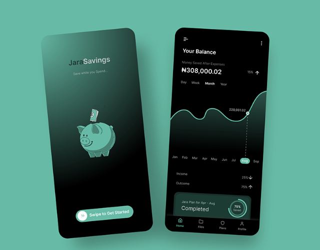
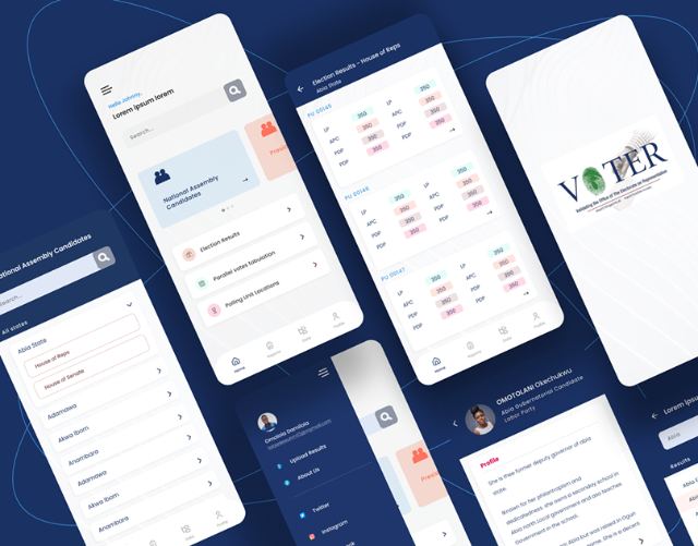
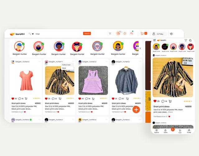
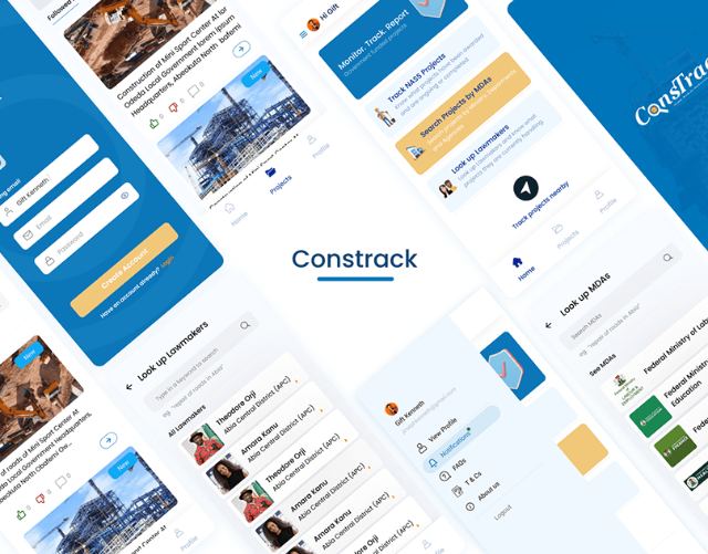
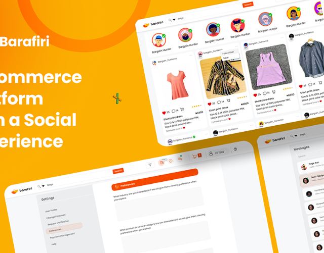
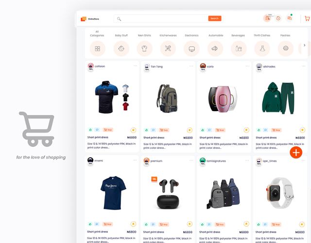
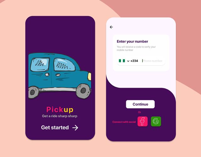
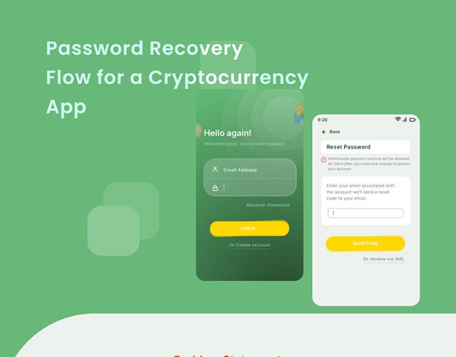
What I've been upto
Product Designer Now
SSE Energy Solutions · UK
2024 — Present
Lead Product Designer Freelance
RepairFind (formerly RedSealFinder), Canada · Remote
March 2023 — 2024
Product Designer Freelance
Andela, New York, US · Remote
February 2022 — 2023
UX Designer
Reliance Infosystems, West End, England · Remote
July 2022 — July 2023
UX Designer
Global Performance Index (GPI), Lagos, Nigeria · Onsite
September 2021 — November 2022
About
Hello! I am Seasoned Product Designer.
UX Research
Responsive Design
UX Writing
HTML/CSS/Javascript
- Figma
- Adobe XD
- Sketch
- Miro
- Protopie
- Zeplin
- Jira
- Teams
- Dynamics 365
- Webflow

What I've been upto
Product Designer Now
SSE Energy Solutions · UK
2024 — Present
Lead Product Designer Freelance
RepairFind (formerly RedSealFinder), Canada · Remote
March 2023 — 2024
Product Designer Freelance
Andela, New York, US · Remote
February 2022 — 2023
UX Designer
Reliance Infosystems, West End, England · Remote
July 2022 — July 2023
UX Designer
Global Performance Index (GPI), Lagos, Nigeria · Onsite
September 2021 — November 2022
Snapshots from projects
Take a peek at what I've been up to.
UX Case Study · #fintech
Weba Online Banking
An online banking platform where users can access both personal and business banking solutions seamlessly.

Project Overview
Weba is an online mobile banking platform where users can access both personal and business banking solutions seamlessly.
Weba web is created mostly for users who access banking solutions through the web, especially business owners who may find it more convenient handling business transactions on the desktop, PC, Pad or on the go.
Research
Understanding The Problem Objective
We approached this project as one set to achieve a goal. Internet banking and online payment platforms have brought ease to individuals and small businesses that carry out financial transactions. We initially set out to find out what portholes users have encountered using these platforms. We did this by conducting a survey, and questions on usability and missing features or functions they would like to be added were asked.
A Likert scale was used in the survey to determine the usability level of the online banking platforms the participants used. 100% of the participants reported they were "very easy" to use.
Participants were also asked open-ended and closed questions on what features they would love to experience when banking online. Survey questions were kept short to avoid overwhelming the participants.
Stating The Objective
We developed an objective from the survey results, and these objectives met varied user pain points.
What is the project's main objective?
To create one web-accessible platform where users can access personal and business banking solutions.
More details
- Create a web platform for mobile-first banking solutions
- Send and receive money to personal accounts
- Access business banking solutions on the same platform
- Access saving plans for both personal and business accounts
- Manage travel plans and bookings
- Send money internationally
Add-ons
Speak with the designated account manager on concerns — in-app staff and customer messaging.

The Users
Internet banking is presumed to be used by any active adult. Our core users are those who prefer or would love to opt for the convenience of banking with a bigger screen than that of mobile, due to the activities they would be carrying out.
Market Research
Who are the big players
Designing a new product that has not yet been introduced to the market has its perks. Recognizing the big players would go a long way in understanding what quality of product you would design that can shake the market.
I did a competitive audit on Monzo Business and NatWest Business — these are Weba's major competitors.
Identifying Users
Weba is designed to be accessible to both mobile and web users; the web application will be mobile responsive and available to use seamlessly on mobile devices.
The objective for the creation of Weba is to create a flexible internet banking solution that is accessible through the web, that primarily exists in mobile-first banking solutions. Therefore our focal users are those who have accessibility to devices with larger screens such as desktops, PCs, laptops and pads — basically screens with a bigger resolution than mobile phones.
Making sense of the chaos
Collating Qualitative Research Data
After defining the target audience, I was left with making sure I understood what their needs really were. I conducted informal interviews, asking questions relating to our product's objective to see if it was really going to make an impact, or maybe it was just solving a problem that did not exist in the first place. I had to be sure, and hearing from the horse's mouth — the users — was my best bet.
After conducting interviews, I now had qualitative data from the initial survey conducted at the beginning of the project, and research I had done on existing financial applications. Collating this data to make sense of it was my next step.

User story mapping
I utilized this agile method of representing and collaborating on user stories for this project. The blue tasks are the high-level tasks, and it distills to subtasks as it changes from red to green downwards.

Information Architecture
I then proceeded to design the IA. This helped in simplifying the whole system and served as a guide to designing the various user stories. It's a simple platform with quite a number of features, and I had to represent each feature in this flow. Features in a shade of pink boxes are features that are not included in the MVP (first release) but were included in the system flow diagram for scalability's sake. Since the team employed the agile methodology, I reviewed this diagram as many times as possible to accommodate any update.

Putting Pen to Paper
Conceptualizing
I call this milestone conceptualizing — the first stage in turning all previous work done into something tangible. This stage was pretty mind-tasking, as I had to decide which positions were suitable for the different elements in the application. For convenience's sake I used paper and pen; if I made a mistake I could easily start on a new clean sheet. The top, left and right panes remained the same throughout all the screens, only the middle contents changed from screen to screen.
Right and left panes were designed to be collapsible, to ensure the user had an option of viewing fewer elements to get a cleaner, less crowded view. I implemented the use of popups too — most features seemed easily accessible if explored through popups, though this would be tested during usability testing to ensure it's good to go.

Design System
I moved on to put together a design system to serve as a guide when designing the high-fidelity prototype. In case of future updates on the design, or new design team members, this design system will make it easier to assimilate changes.
The color system fully represented the brand colors, General Sans variable font was used throughout the project, buttons were given a 10px curve on the edges to make them visually pleasing, and so much more interesting detail was considered when putting together the design system.

Component Library
I created re-usable components that can be used throughout the lifetime of this project. This made alterations very easy — make changes on one of the components in the component library and it is effected on all screens where the component was used. This was a game changer, as it helped me save a lot of time when making changes to effect feedback.

Security
Secure Login
Every screen needed to create a seamless flow of interaction was designed, no matter how small the change was. This was done to ensure every element of the application was in tune — we do not want a loading button having a different color from the project's accent color. Leaving out bits and pieces for the developers to fill in may result in inconsistency in the design.
Since Weba Business is available to its mobile users to subscribe, security was linked to their mobile apps. Users have to confirm login through email and their mobile apps. A code login system is to be introduced in later versions of Weba for web.

Exploring pop-ups
Making Payments with Weba
Multi-step payment flows explored through popups, each with its own confirmation state, so nothing is committed without the user seeing exactly what is about to happen.


Get paid, Invoicing, Receipts
The business side of the platform — raising invoices, generating receipts and tracking what has been paid — sits in the same navigation as personal banking.


Bill payments, loans, savings


Usability
Heuristics Evaluation
We conducted a heuristics evaluation to ascertain the usability of this application. We involved four experts — Chidi, Iyke, Reiner and Diana. These are all expert evaluators and they were asked to carry out specific tasks. Each evaluator was required to carry out the following, step by step:
Jot down usability problems encountered on each task on the task form, using Nielsen's Usability Heuristics.
Rate these usability problems using Nielsen severity ratings.
Fill the heuristics data capture form.
The final step was my job to do. I had to merge these results and make informed decisions that would serve as constructive feedback to make changes to the design.
Communication and collaboration
Design Handoff
At every milestone of this project, I communicated effectively with the developers and product manager. So when it came to the point of handing off the design to the developers, they already knew what to expect. It was the MVP — majorly priority features had been designed at this time.
I put in place interactions and notes on the artboard to serve as a guideline to what is expected at each scenario I felt may be misunderstood. Handoff was smooth, but as usual I still had a few questions coming in from the developers from time to time.
My next line of action was to follow through with design and ensure what was being developed is in line with the approved product design.
Blockers
Challenges Faced
Incomprehensive Product Requirement Document (PRD)
One major challenge encountered was the scantiness of the PRD — it was more like an idea jotted down. The project's purpose and features were stated, but functionalities and behaviors were not included, leaving me with the job of figuring out a lot of things.
A comprehensive PRD helps in interpreting the client's objective and goal of the project better. It also poses as a guide to the designer when designing. For aesthetics' sake a designer may be inclined to add unnecessary elements or features, but with a comprehensive PRD the designer is obligated to stick to the requirements.
The other challenge would be having to work solo on this project on a thin timeline.
Nothing good comes easy
Key Learnings
I learnt a lot while working on this project, but what stood out for me was the importance of proper research and planning. Understanding your objective from the get-go and doing things in an orderly manner will greatly improve work output and even reduce turnaround time!
Got a product that needs this kind of thinking?
Tell me what you're building and where it's stuck.
Contact meSocial Networking · 5 mins read
Unibuddies
A social app for university students in the UK to connect, and keep up with school events.

Meet Unibuddies
Unibuddies is a mobile application targeted at university students that helps them connect with each other through their similar interests.
The main target audience is the student, along with university staff and various clubs.
Unibuddies members can expect to find people that share the same interests as them, social groups and student events. They will be able to find chat-rooms in different groups and chat privately with fellow students. Members can also expect to find event information and links where they can purchase tickets.

Getting Answers to Important Questions
After conducting a user survey, we noticed that participants do struggle with finding other people who share the same interests and they would be interested in an app that allows them to easily connect in this regard.

"Networking is not about just connecting people. It's about connecting people with people, people with ideas, and people with opportunities." — Michele Jennae
We decided to create a solution that will allow students make meaningful connections around their interests, taking note of Michele Jennae's quote on how networking is not about just connecting people.
Brainstorming
To get started, we tried empathizing with potential users of the app, as students ourselves, coming up with possible solutions to the problem discovered.

People or Groups Affected by Unibuddies
Mapping out everyone with a stake in the product — students, university staff, club organisers and event attendees — kept the design decisions honest about who each feature was actually for.

Competitor Analysis
From the competitive analysis done, here is a list of ideas generated, that could be executed at the MVP phase:
- Users should be able to join events via code, search or see popular events near them or worldwide.
- Users should be able to choose between being an attendant, an organizer or both.
- There should be options for organizers to do paid sponsorships for their events to reach more audience.
- Organizers should be able to create event codes to share to intending attendees.
- 1:1 chats and group chats for easier connections with people.
- Attendants should be able to sync their events/meetings with their calendar. Events can be online or physical.

Prioritizing Features
There are a number of features that would make Unibuddies stand out, but the timeframe posed as a hindrance to the feasibility of designing solutions for these features. Prioritizing these features helped ensure must-have features can be attended to first.

User Personas
The personas provided a clear understanding of the target audience. We can refer to personas during the design process to align our decisions with the users' goals, preferences and limitations. By having personas in mind, we can prioritize features and functionalities that are most relevant to their users, ensuring that the final product meets their needs effectively.

Style Guide
Cool and warm colors were used in the design of Unibuddies. A semi-formal font (Quicksand) was used to depict the essence of the app — "unwind", "have fun", "socialise", "learn new things".

The Design
Initial Sketch

Sign Up

Onboarding & homepage

Groups & Events


Collaborators
Reiner S. Brito Carvalho, Diana Cristina Iliescu, Ikechukwu Anyanwu.
Case study · #govt.
RemTrack
Civic-technology tooling that makes remediation, host community and CSR commitments in Nigeria's extractive sector visible — and trackable — by the people they affect.
Overview
RemTrack is a technology-for-development platform built around accountability in Nigeria's extractive industries. It gives individuals and organisations a way to track remedial issues, host community commitments and CSR obligations, and to see whether what was promised has actually been delivered.
The design problem
Products like this have two audiences at once. Officials and analysts need density — records, status, cash-call management, the detail behind a claim. Citizens need clarity — a plain answer to whether something is being fixed, and a way to report when it isn't.
The design work was largely about holding both without compromising either: keeping dense tracking views legible, and making reporting simple enough that someone with no training can complete it correctly the first time.
What I worked on
- Stakeholder research across officials, analysts and community reporters
- Tracking views for remedial issues, host community commitments and CSR obligations
- Reporting flows that work for non-expert users
- Usability testing and iteration on the data-heavy screens
The full write-up — research, process and screens in detail — lives on Notion.
Working on something in the public interest?
This is the work I care most about. Get in touch.
Contact meCase study · #energy
SSE Renewals
Online renewals for energy business customers.
Online renewals
for energy business customers
Write-up in progress
Case study coming soon
I'm putting this one together — the research, the decisions behind it and the screens that came out. It'll be here shortly.
Case study · #energy · #B2B
Energy Online Quoting
Online quoting for B2B energy customers.
Online quoting
for B2B energy customers
Write-up in progress
Case study coming soon
I'm putting this one together — the research, the decisions behind it and the screens that came out. It'll be here shortly.
Case study · #saas
RepairFind
A SaaS platform for the repair trade.
Write-up in progress
Case study coming soon
I'm putting this one together — the research, the decisions behind it and the screens that came out. It'll be here shortly.